November 2019, I joined a brilliant mobile app design team at Discovery as a UX/UI Designer. The team had a well-documented style-guide, but it had a very important component that was missing, that component was spacing.
As a new designer joining a team, my worst fears were to use the components in the library in a way that would make my designs look different from the rest of the app. Spacing has a direct impact on how the app looks, it gives the layout a united feel. When I realised that spacing was not formally defined I volunteered to start the process of defining a Spacing Guide for the Mobile App.
Why did I propose a spacing guide?
1. Pain points with the current Developer Handoff Tool
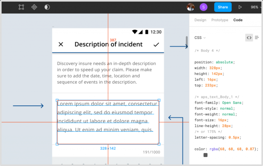
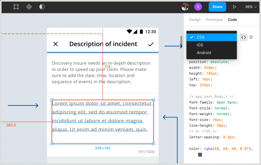
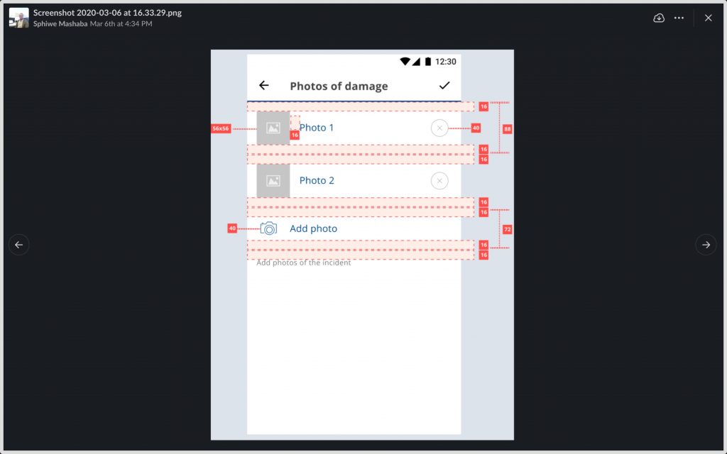
Developers use Figma to access the metrics and measurements of the design. Figma has a handoff tool that shows the code for the selected design elements, but it does not show the spacing between elements.
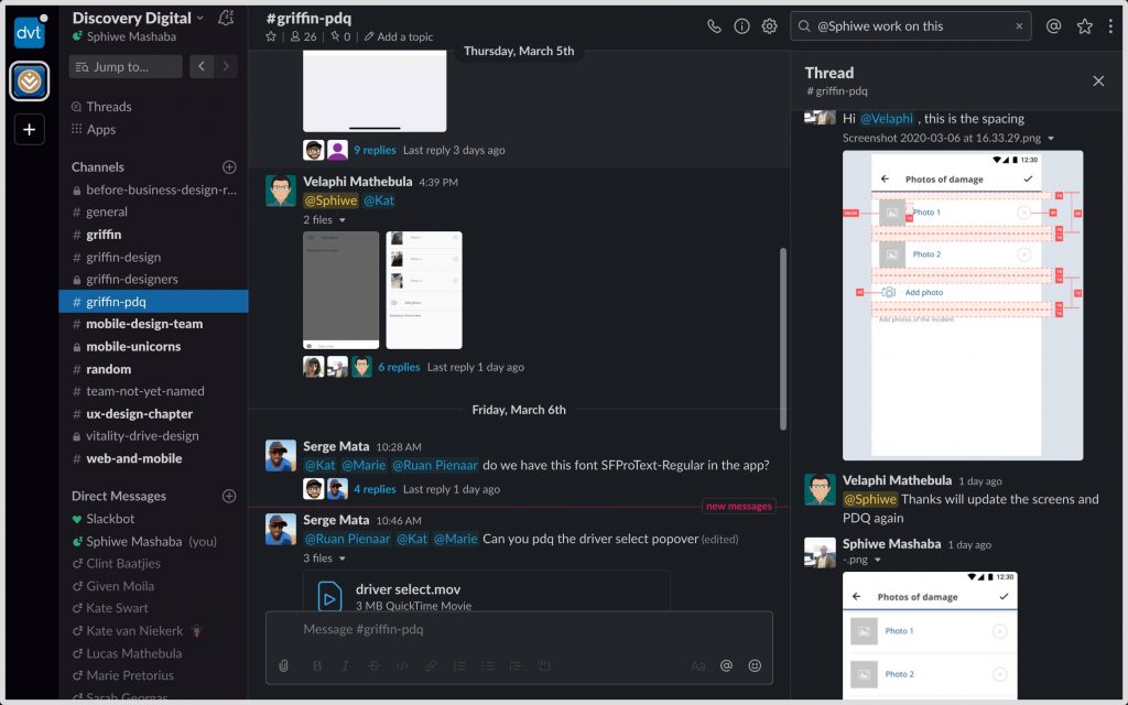
2. PDQ channel on Slack
We have a slack channel where the developers upload screenshots of the screens that they have completed. The designers have to review the screens and suggest fixes if any. The spacing of elements is a big problem because the spacing is based on what each developer see on Figma, and sometimes they do not see things correctly.
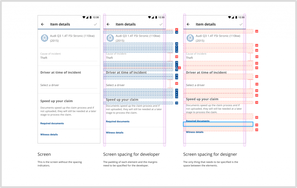
Spacing for designers VS Spacing for developers
Can front-end developers look at a basic UI design spacing guide and be able to translate the simple spacing into margins and padding?
The spacing guide is easy to define from a designer’s point of view, for example, 16px between two elements on Figma is exactly that, But, from a front-end developer’s view, 16px between 2 elements might mean 2 margins that are 8px each or a single element with a 4px padding and a 12px margin.
I did not want to create a guide that would only assist designers in creating compositions on Figma, I wanted a complete solution that also helps front-end developers align their spacing with that of the designers seamlessly.
The simple solution
The team had 2 developers who maintained the component library full time. Those developers agreed to include the padding and margins in the logic. Meaning, we only need to create a single guide that details the spacing of components and the component library developers to update the current component.
The solution is brilliant because the developers that are building the app will not need to worry about spacing as it will be predefined for them.
The spacing guide
Unit of measurement
Use density-independent pixels (dp) as the unit of measurement to enable proportional scalability. One density-independent pixel (dp) is equivalent to one physical pixel on a 160dpi screen. All these guidelines are based on a 160dpi screen.
Grids
I used material.io as a reference for the gride guide. All components align to an 8dp square baseline grid. Icons and type align to a 4dp grid.
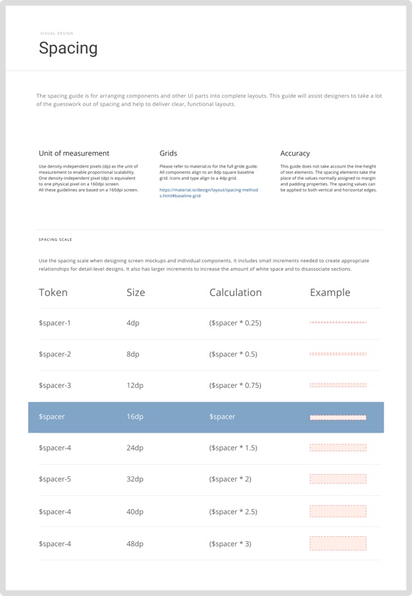
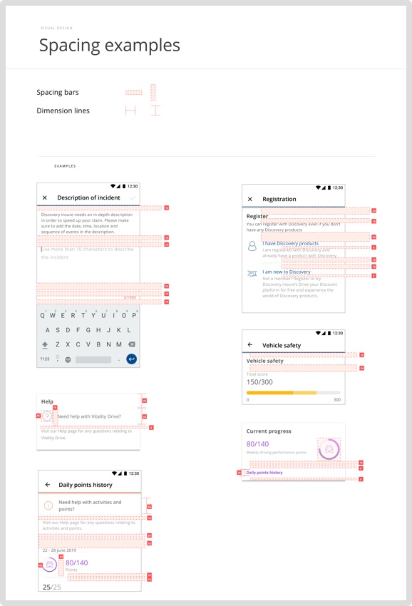
Spacing scale
Use the spacing scale when designing screen mockups and individual components. It includes small increments needed to create appropriate relationships for detail-level designs. It also has larger increments to increase the amount of white space and to disassociate sections.
Spacing tokens
The spacing tokens are used to apply the margin and padding across elements, components and layouts. Since the design tokens store the spacing values, this method of spacing can be shared across multiple apps and websites.
Conclusion
Once implemented this approach will help the team with the following:
- Front-end developers would spend less time on Figma trying to figure out the spacing of elements.
- Their screens will pass the designer’s review more often.
- They will have peace of mind that they are developing in the same vertical rhythm.
What I learned on this project
Always raise design concerns no matter how trivial they may seem