I had the opportunity to design a logo for a start-up in the food industry. The name of the brand is “JusEat” and my role in the project was that of a Graphic designer.n 2016, I was tasked with designing a platform that will enable employees to do away with social media apps such as WhatsApp in the workplace. I had the opportunity to design a logo for a start-up in the food industry. The name of the brand is “JusEat” and my role in the project was that of a Graphic designer.
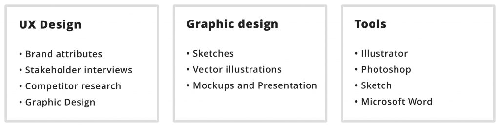
My Role and key responsibilities
I worked closely with the 2 founders of the company to deliver the project. My role was that of a graphic designer but I also had to do research work on the project.
Competitive research
Before starting with any design work I devoted time to understand the online food industry. The client was new to this industry and trusted me to help them navigate the competition and come up with a logo that will stand out.
JusEat is competing in the home-cooked meal category. They are targetting working-class South African’s who want a home-cooked meal that can be ordered online. There are many companies that prepare home-cooked meals in South Africa, I searched for the competition online to see what their branding looked like so that I know exactly what I am competing against.
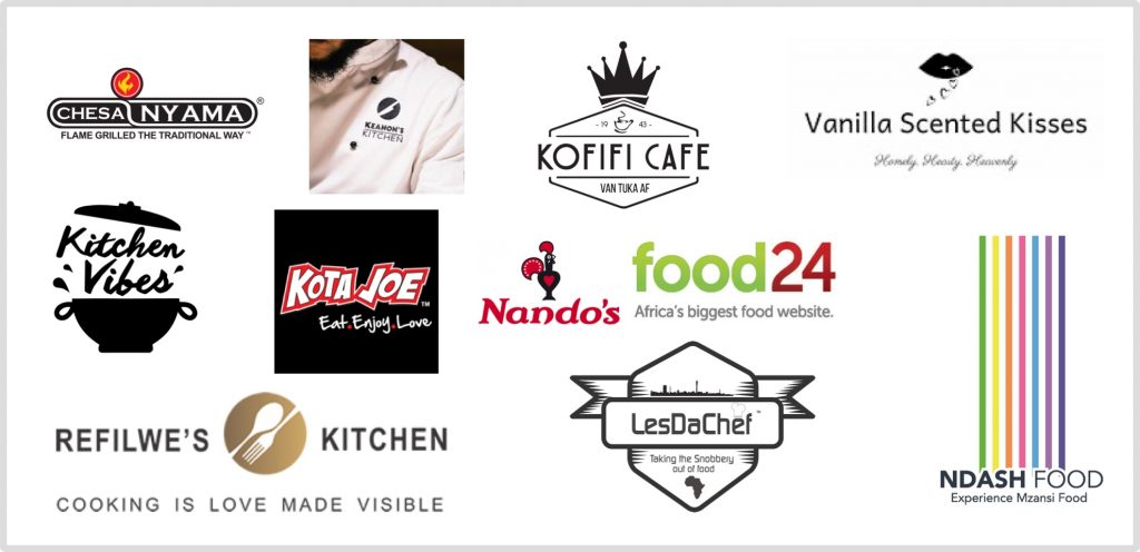
Unfortunately, not many of the companies in the home-cooked category had a complete online presence. The few that I found did not have websites, just social media pages. Most of the Companies did not even have a logo, they used the face of the founder/head chef as the brand ambassador.
Brand attributes
We needed to establish what the company was going to stand for so we gathered attributes that best described the brand that the founders wanted to build.
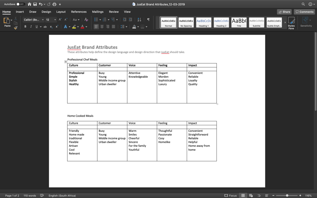
We used the brand attributes to define the culture of the company, the type of customer that they wish to attract, the voice or tone of the brand, the feelings that they would like the brand to invoke and the impact that they want to make.
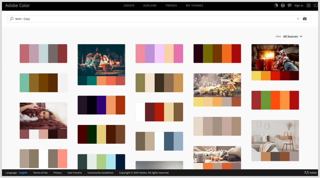
Once brand attributes had been established we could associate them with colours by following basic colour psychology and using Adobe Color.
Stylescapes
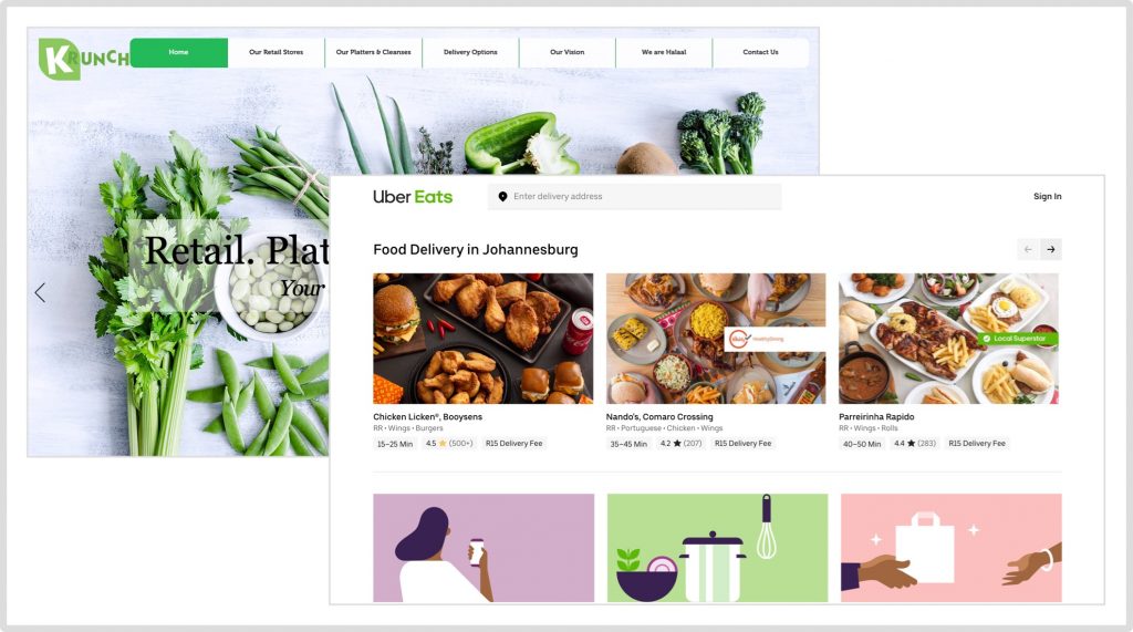
It is a bad idea to start designing a logo without establishing a look and feel for the brand. I had 2 possible directions that I could take. The first direction was a modern start-up look and feel, very clean, minimal and lots of white space, think Uber Eats and Krunch.
The second direction was authentic south African, very warm colours and culture orientated, think Nando’s.
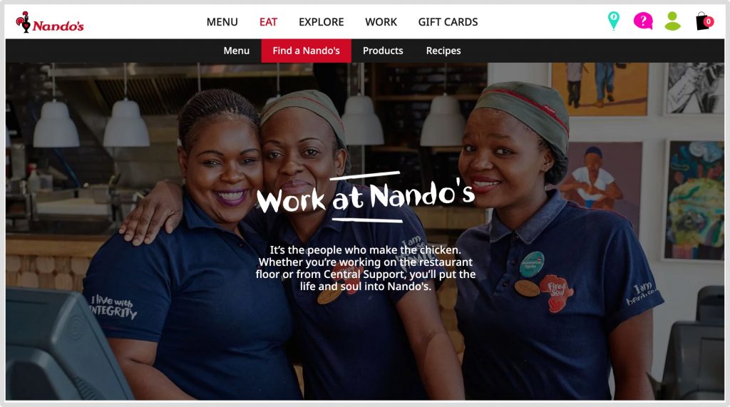
I created 2 Stylescapes that illustrate each of the directions. I asked the client to select a direction that they liked and pick design elements that stood out for them. The client selected the home-cooked meals stylescape.


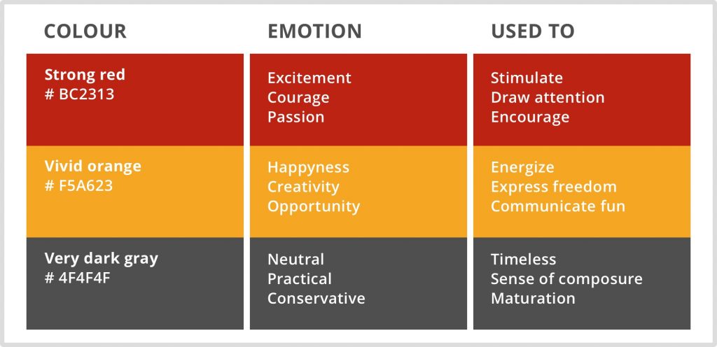
Brand colours
Vivid orange: Orange is associated with foods that are wholesome and satisfying, like bread, stew and potato products. Orange works very well with the JusEat brand as their entire menu consists of home-cooked meals.
Strong red: It is believed that red triggers appetite, which is the reason why it’s used in most food packaging. Red is also found in natural foods and it usually indicates ripeness in fruits such as apples and tomatoes.
Very dark grey: Grey is a conservative and dignified colour. Grey fits in with the brand because JustEat stands for reliable and consistent quality.
Logo sketches
I sketched my logo ideas to get a few concepts going. I did not present these to the client because they were specific about seeing full-colour logos. I know it is not the best way, but this was a very good client and I did not mind the request.
First Logo designs
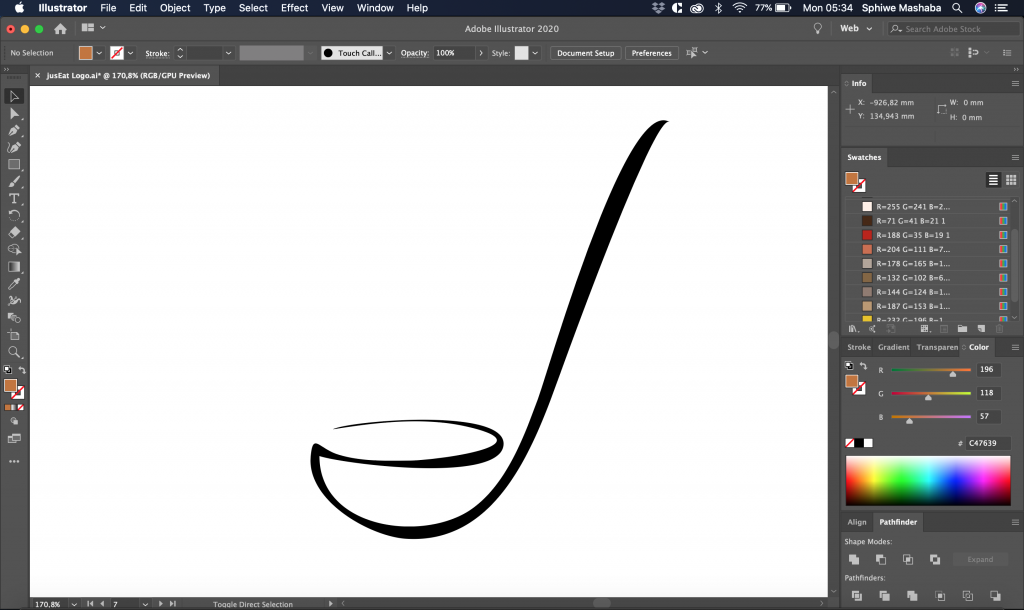
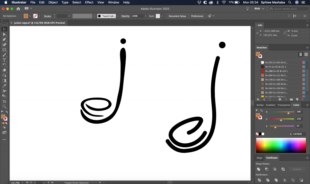
These are the initial designs of the JusEat logo. The client selected logo number 4, they appreciated the visibility of the letter “e” and “j” in the logo. They also liked the use of a ladle in the logo because they served home-cooked meals.
Refining the selected logo
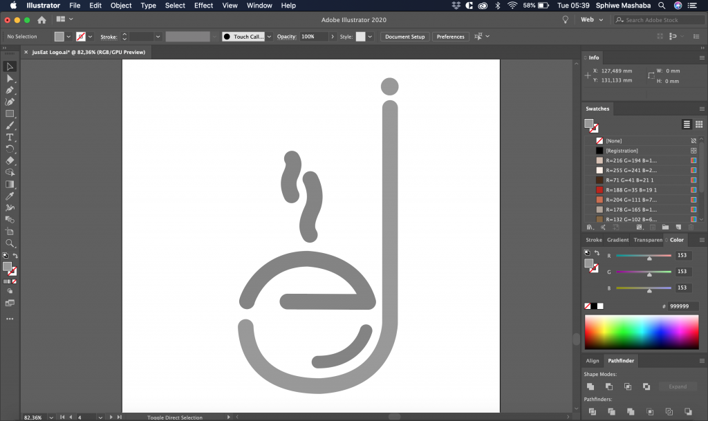
The client wanted the “e” and “j” to be clearly visible as well as the ladle.
Final design
The Client was pleased with this variation of the logo, it was also my favourite.
Logo guidelines
When I delivered the logo I created a guideline document that illustrates how the logo should be used.
What I learned on this project
Be faithful to the role of helping the client realise their vision. The logo that the client selected in the first iterative stage was not my favourite, but in the end, that logo best represents the brand.