In 2016, I was tasked with designing a platform that will enable employees to do away with social media apps such as WhatsApp in the workplace.
To honour an NDA I am unable to share the application in its entirety. The name and logo have been changed to protect the information of the actual application.
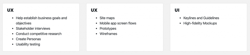
Chapter 1: My Role
I have been the lead UX/UI designer of this Intranet project for its Android, iOS and Web portal since the project’s conception in September 2016.
Key Responsibilities
I worked with two designers and two project managers on this project. My team gave me multiple perspectives and an opportunity to have a broad exploration which brought about features that will stimulate user participation.
Chapter 2: Understanding
The process to understand this product started with a four-hour stakeholder workshop with all the relevant stakeholders. This workshop enabled us, the UX/UI team, to get insight into the project’s scope. There was no formal brief for this project so this meeting gave me all the information I needed to create my own brief for my team.
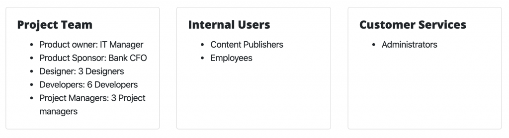
Stakeholder Checklist
The most important piece of information was to determine who our stakeholders were. To deliver a product that reflects the company’s business requirements we had to have access to the managers with the key information. Below is a list of the stakeholders that we had access to.
Business Goals
The stakeholder workshop was well attended by the key stakeholders. The list of attendees included decision-makers from the banks marketing, IT and operations departments. On our team, we had our UX/UI members on hand. During the workshop, we were able to define the business goals with the stakeholders.
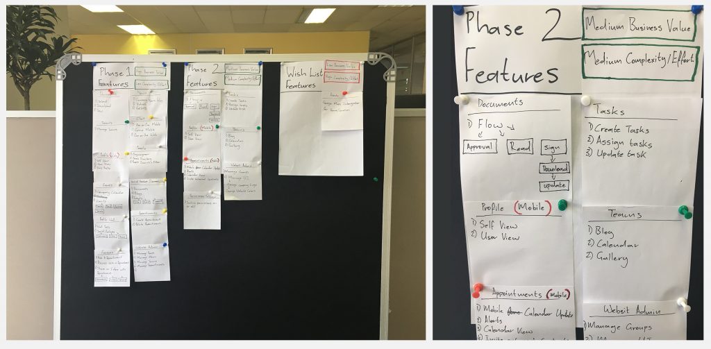
Since the workshop was attended by decision-makers we were able to translate these goals into compulsory, achievable and non-achievable project features by using a priority exercise.
Competitor Research
When it came to competitor research we divided the workshop into 2 teams. Each team worked on two different competitors to find out what worked and what was missing on their product offerings. This method of competitor research enabled the team to thoroughly investigate four competitors using half the time. After the research was conducted, each team presented their findings to the workshop.
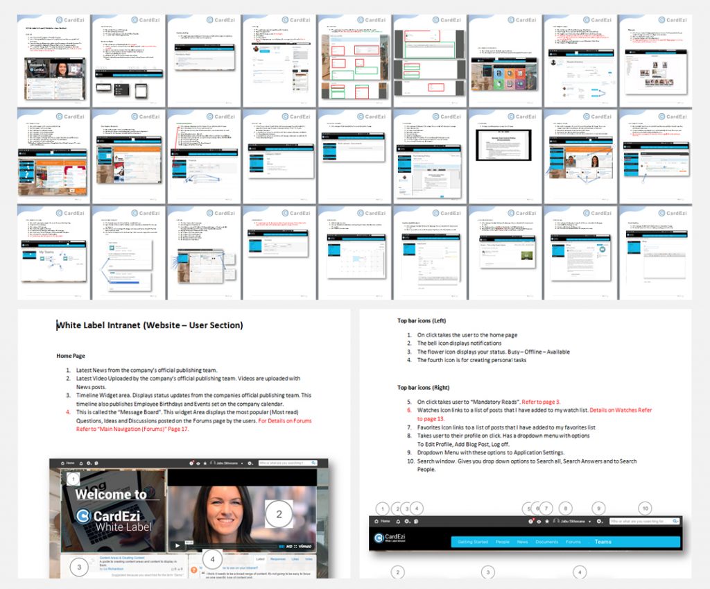
I took notes and collected all the elements which stood out from each of the presentations. I went back to my drawing board, I took screenshots of all the competitor’s products and created collages that label and explain all the features which impressed the stakeholders.
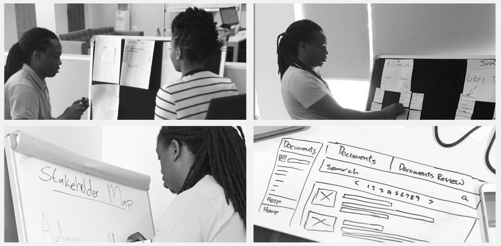
Sketching
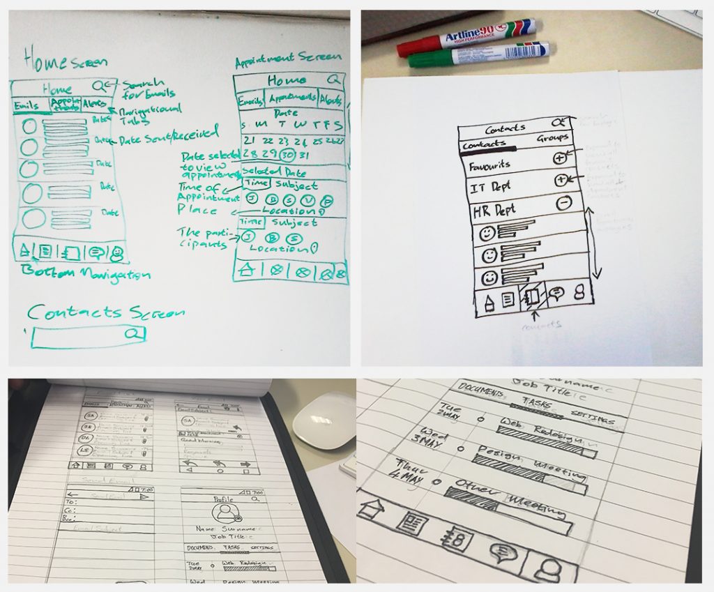
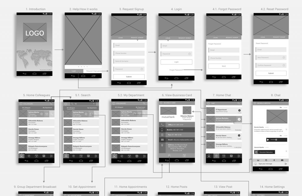
We took advantage of our well-attended stakeholder meeting and completed quick sketches of the main web pages and mobile screens. On the web portal, we sketched the Home, Documents, News, and Teams pages. On the mobile app, we covered the Home, Appointments and Contacts screens. These sketches were all approved, so this meant that we had a validated base for the direction of our wireframe designs.
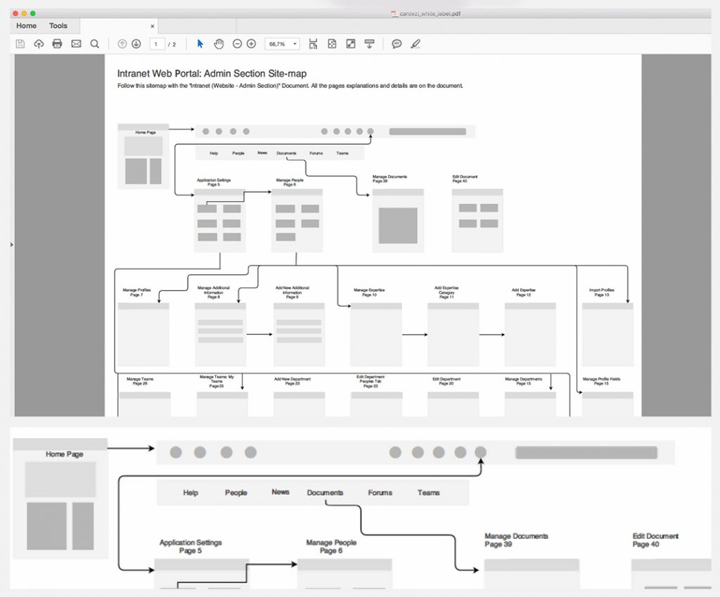
Information Architecture
The website navigation, app screen flows and sitemap were all defined in a meeting with the marketing and IT manager. The marketing team was providing us with the information for the platform, so we relied heavily on their input in order to shape the page hierarchy and screen flows of the application.
Chapter 3: Wireframe
We had a total of three weeks to complete the wireframe designs, two weeks to complete the website portal wireframes and one week for the mobile app. We only created android wireframes for the mobile application. After the approval of the Android wireframe designs, we then duplicated those screens and converted them to iOS UI specifications. This meant replacing all Android-specific UI elements and actions with designs that are unique to the iOS Graphical User Interface. For example, on android, we have dialogue screens for displaying certain dropdown options, while on iOS we navigate to a completely new screen to access the dropdown options.
Guerilla Usability testing
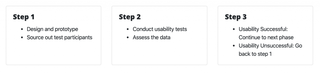
We needed user feedback for our wireframe designs and flows before we could present them to the client. User feedback was an important part of this major deliverable because we needed to justify the validity of our design decisions and navigational flows. We conducted guerilla usability testing for this phase because time was not on our side.
We spent two days on this process, the first day we conducted the tests and collected the data, and on the second day, we analyzed the data and made the necessary changes to the wireframes. We used a prototype that we designed on Adobe XD to conduct the usability tests. We conducted the tests on ten candidates. Our test participants were members of staff in our office and the incentive was a free McDonald’s Lunch.
Stylesscape
We created three stylescapes to present after the wireframes had been approved. The stylescape is critical before creating the final mockups because it finalizes the basic design decisions such as colours, fonts and the type of artwork. The Stylescape presentation and discussion clarified exactly what the mockups should look like.
We moved onto the mockup and prototyping phase after we received stakeholder validation for our wireframe designs. The reason for this is we did not want to waste time with rework on high fidelity designs and prototypes.
Chapter 4: Mockup and Prototyping
For the purpose of clear design leadership, I created the initial Keyline’s and guidelines for the app and web platforms. The rest of the designers could extend and use these guidelines and work with the confidence that we are all on the same page.
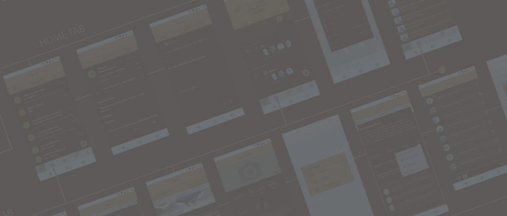
Mobile Mockup
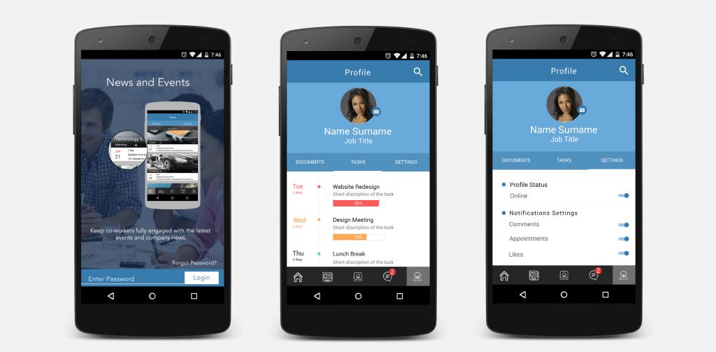
This project was designed on Photoshop and Illustrator. Because we had well-detailed wireframe designs and a defined design direction, we only needed 3 weeks to complete the mobile mockups for iOS and Android. After the completion of the high fidelity mockups, we moved onto creating a fully interactive prototype for the android app. We chose to create an android prototype because a large percentage of our users have android devices, thus the usability results on an Android prototype will speak for a broader user base.
Web Portal Mockups
The high fidelity web page designs were designed in groups of main templates for each section. For example, the documents section had 3 templates. Template one: Documents landing page; Template two: View document page; Template three: Upload document page. The website has a total of 7 sections namely Home, People, News, Documents, Forum, Teams and Mail.
The administration panel on the web portal was not designed with graphical features. We kept it as simple as possible with just HTML and CSS on the frontend, this made for great loading time optimization.
News
The intranet administration team can upload news articles from various sources for corporate consumption. View company news and announcements. The user can like, comment and share the articles. Add the article to favourites. Company news can target a specific department or team. Increase employee participation in corporate initiatives.
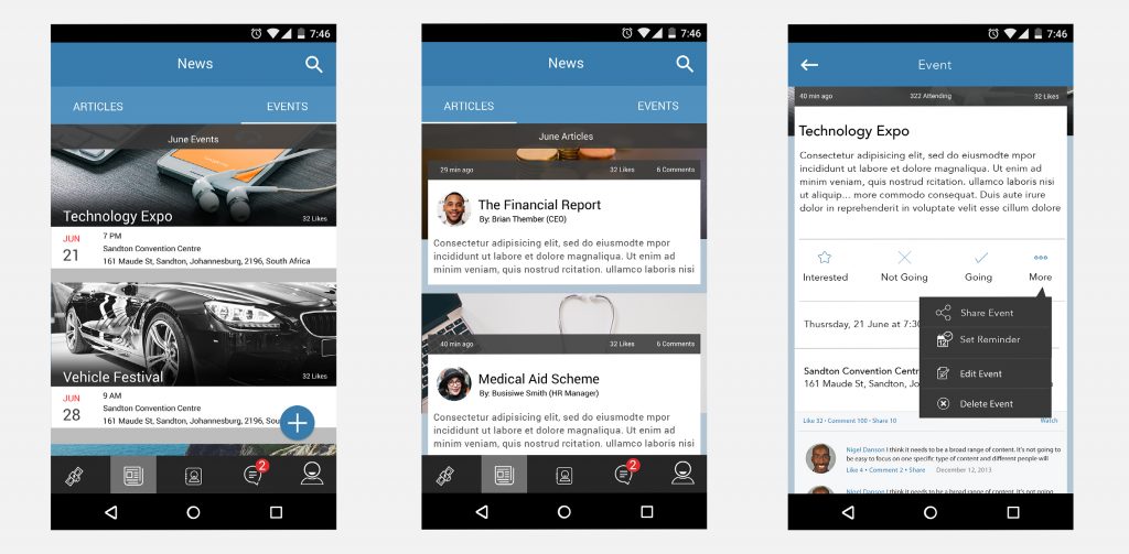
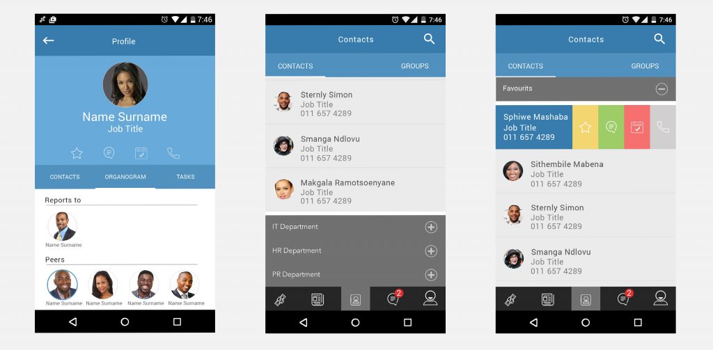
Contacts
The user can browse a list of the company contacts. They can also chat with contacts and call contacts directly. The swipe buttons give the user quick access to call, set appointment and chat options.
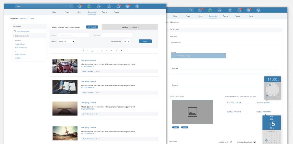
Documents
The web portal sorts all documents by departmental. The documents section provides a central place to access all the company documents, corporate resources and training material.
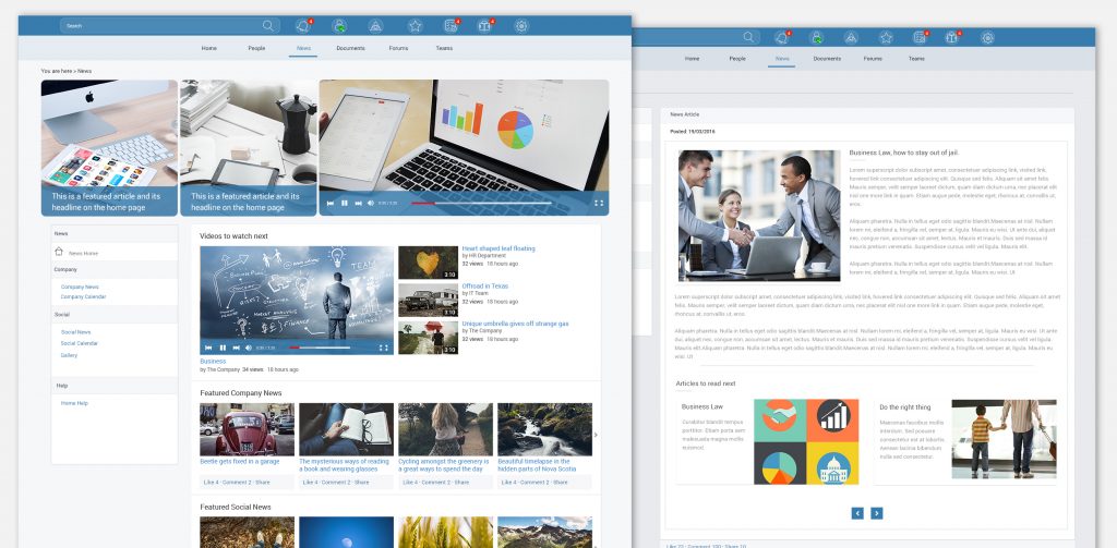
Web Articles
The web portal sorts all documents by departmental. The documents section provides a central place to access all the company documents, corporate resources and training material.
Chapter 5: Usability Testing and Validation
I interviewed ten test participants who helped us conduct our usability testing. The main aim was to get at least 5 testers who fit the user personas which were defined during the research phase. The tests, both for web and mobile, were conducted using the high-fidelity prototypes that were created using Invision.

Usability testing
This particular test is crucial because we will be receiving feedback on the overall design of the product. The usability tests on the previous stages focused on problem-solving and task completion analysis. This test will cover the same disciplines as the previous tests and also tell us if the functionality of our application fits well with our overall design.
We split the test users into groups of 5. The first group uncovered about 85% of bugs and usability issues within the prototype. We duplicated the prototype and made changes and fixes to the upgrade. After 2 days we tested the second group of users on the upgraded prototype. We gathered the results from the two test groups and compared the findings. The second test showed substantial improvement in the usability and errors recorded. The showed the product is headed in the right direction.
What I learned on this project
Listen to what the user tells you, but at the same time, do not disregard business goals to fulfil every one of the user’s needs. Having empathy for both the user and business will result in better solutions.